Live panels bound to your broker data — written in the Dashboard Manager or generated by the AI Assistant.
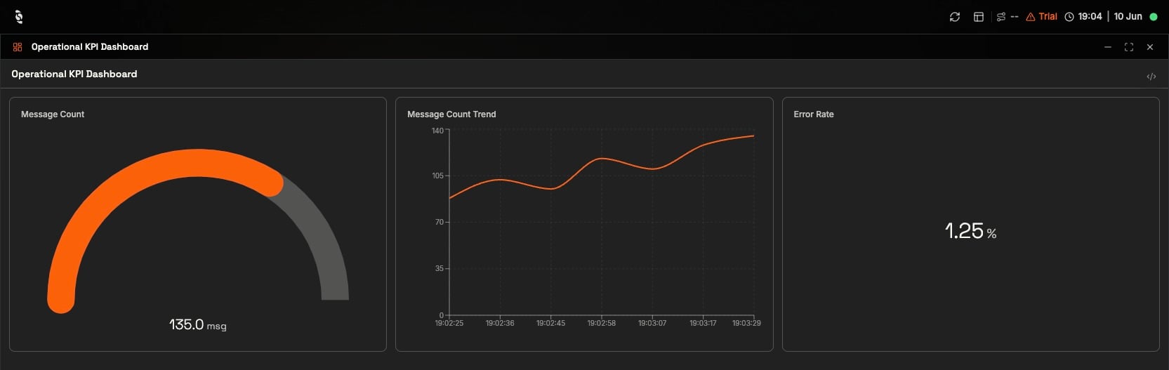
A published KPI panel running full-screen — a gauge, a live trend, and a numeric readout, all bound to broker topics
Dashboards in Coreflux are panels: live screens assembled from components — gauges, charts, controls — each wired to data flowing through your broker. You write them in the Coreflux HUB Dashboard Manager, where the panel definition and its live result sit side by side, or you ask the AI Assistant to build one for you and refine it from there.
Like a control room sketched in plain text. You describe a gauge, point it at a signal, and it shows that signal live from the moment you save — no wiring diagram, no deploy step.
KPI walls — large readouts and trends for supervisors
Line and area overviews — at-a-glance status for a process or zone
Machine detail — gauges, indicators, and controls for a single asset
Operator stations — buttons, toggles, and setpoints where people work the process
Shift and mobile views — simplified layouts for tablets and shared screens
Panels are authored as LoT (Language of Things) definitions — the syntax is documented under LoT PANEL, which versions with your broker. The rest of this page is a quick tour of what the HUB renders; every widget has a full reference linked at the end.
Open Dashboards in the HUB, click Create new panel, and write the definition below. The panel renders live as you save — point a gauge at a topic and the needle starts moving:
The saved panel: a live gauge reading 82.0 °C from the temperature topic
DEFINE PANEL SensorMonitorWITH VISIBILITY PUBLICWITH STATE PUBLISHEDWITH TITLE "Sensor Monitor"WITH LAYOUT "grid" COLUMNS 2 ADD COMPONENT "TempGauge" WITH TYPE "gauge" SET RANGE FROM 0 TO 100 SET UNIT "°C" BIND VALUE TO TOPIC "sensor/temperature"
Every part of a definition is covered step by step in Defining a Panel.
Describe what you want in plain language:
“Build me a panel with a radial temperature gauge on sensor/temperature, range 0–100 °C, with a warning threshold at 75.”
The assistant creates the panel for you. Open it in the Dashboard Manager to see the definition it wrote — and adjust anything directly. See AI Assistant.
Include WITH VISIBILITY PUBLICandWITH STATE PUBLISHED in every panel definition — panels saved without them may not appear in the Dashboard Manager list. See Defining a Panel.
A value with context: range, unit, and thresholds.
A radial gauge bound to the temperature topic, with a 75 °C warning threshold configured
ADD COMPONENT "TempGauge" WITH TYPE "gauge"
    SET RANGE FROM 0 TO 100
    SET UNIT "°C"
    BIND VALUE TO TOPIC "sensor/temperature"
The big number — unit, decimals, wall-readable.
A formatted error-rate readout with two decimals
ADD COMPONENT "ErrorRate" WITH TYPE "value"
    SET LABEL "Error Rate"
    SET UNIT "%"
    SET DECIMALS 2
    BIND VALUE TO TOPIC "kpi/operational/errorRate"
State at a glance — values mapped to colors.
A status dot that turns green for running and red for stopped
ADD COMPONENT "MachineStatus" WITH TYPE "indicator"
    BIND STATE TO TOPIC "machine/status"
    SET ON_VALUE "running" WITH COLOR "green"
    SET ON_VALUE "stopped" WITH COLOR "red"
A banner that appears when a condition is true.
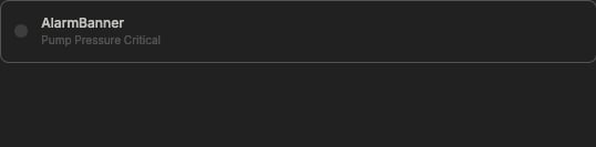
An alert banner showing the live alarm message while the alarm flag is true
ADD COMPONENT "AlarmBanner" WITH TYPE "alert"
    BIND VISIBLE TO TOPIC "pump/alarm_active"
    BIND CONTENT TO TOPIC "pump/alarm_message"
    SET VARIANT "critical"
Builds a live trend from individual data points on a topic.
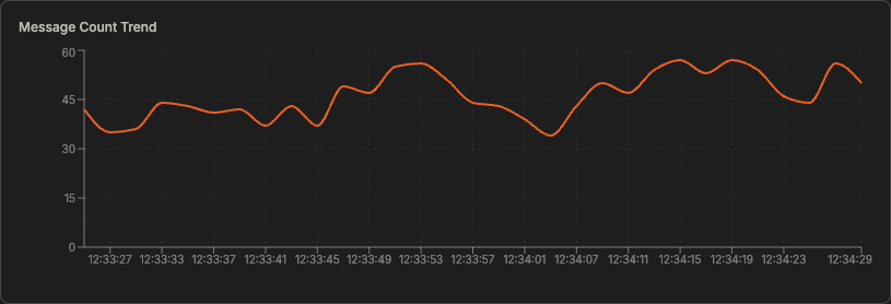
A realtime-chart building a line from values as they arrive
ADD COMPONENT "MessageCountTrend" WITH TYPE "realtime-chart"
    SET LABEL "Message Count Trend"
    SET CHART_TYPE "line"
    SET UNIT "msg"
    BIND VALUE TO TOPIC "kpi/operational/messageCount"
        SET SERIES_LABEL "Message Count"
Rows from a JSON array topic or query result.
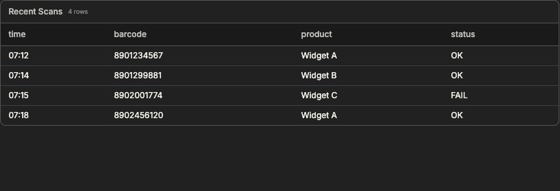
A table populated from a JSON array topic
ADD COMPONENT "ScanHistory" WITH TYPE "table"
    BIND DATA TO TOPIC "barcode/history"
    SET COLUMNS "time, barcode, product, status"