Reading and writing panel definitions: structure, layouts, positioning, and lifecycle.
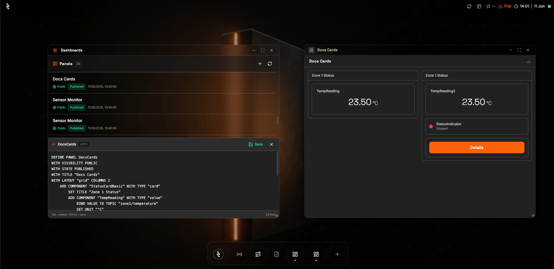
A panel definition and its live result, side by side in the Dashboard Manager
Every dashboard is one DEFINE PANEL block, written in the Dashboard Manager or generated by the AI Assistant. The block names the panel, sets a few panel-wide attributes, and lists the components it contains — this page walks through each part.
Like a recipe card for a screen. The header says what the dish is and how the table is set (title, layout); each ingredient line below adds one widget and says where its data comes from.
Start with the smallest complete panel, then each section below adds one concept: reading the syntax, layouts, positioning, and lifecycle.
A panel opens with DEFINE PANEL, four panel-level attributes, then one or more components:
DEFINE PANEL MyPanelWITH VISIBILITY PUBLICWITH STATE PUBLISHEDWITH TITLE "My Panel"WITH LAYOUT "grid" COLUMNS 3 ADD COMPONENT "MyComponent" WITH TYPE "gauge" SET RANGE FROM 0 TO 100 BIND VALUE TO TOPIC "sensor/temperature"
The panel name (MyPanel) identifies the panel in the Dashboard Manager.
WITH VISIBILITY and WITH STATE declare the panel’s audience and lifecycle — see Lifecycle and visibility.
WITH TITLE is the heading people see; WITH LAYOUT arranges the components.
Components are added with ADD COMPONENT "<name>" WITH TYPE "<type>".
Always include WITH VISIBILITY PUBLIC and WITH STATE PUBLISHED. A panel saved without them may not appear in the Dashboard Manager list.
The layout is declared on the panel header and controls how the panel’s top-level components are arranged:
Layout
Syntax
Use it for
Grid
WITH LAYOUT "grid" COLUMNS 3 ROWS 2
Most dashboards — explicit placement and spans
Vertical
WITH LAYOUT "vertical"
Simple stacked mobile/tablet views
Horizontal
WITH LAYOUT "horizontal"
Strips of KPIs on wide screens
Each tab below arranges the same three station readouts with a different layout — only the WITH LAYOUT line changes:
Grid
Vertical
Horizontal
Components flow into the declared columns, one cell each:
Grid: the three readouts fill one row of three columns
DEFINE PANEL StationGridWITH VISIBILITY PUBLICWITH STATE PUBLISHEDWITH TITLE "Station — Grid"WITH LAYOUT "grid" COLUMNS 3 ADD COMPONENT "Temperature" WITH TYPE "value" BIND VALUE TO TOPIC "station/temperature" SET UNIT "°C" ADD COMPONENT "Humidity" WITH TYPE "value" BIND VALUE TO TOPIC "station/humidity" SET UNIT "%" ADD COMPONENT "Pressure" WITH TYPE "value" BIND VALUE TO TOPIC "station/pressure" SET UNIT "bar"
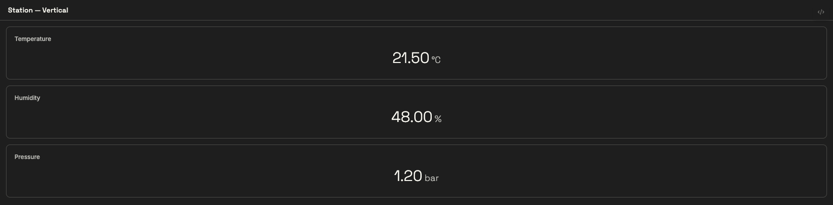
Components stack top to bottom, each taking the full width:
Vertical: the same readouts stacked full-width, top to bottom
DEFINE PANEL StationVerticalWITH VISIBILITY PUBLICWITH STATE PUBLISHEDWITH TITLE "Station — Vertical"WITH LAYOUT "vertical" ADD COMPONENT "Temperature" WITH TYPE "value" BIND VALUE TO TOPIC "station/temperature" SET UNIT "°C" ADD COMPONENT "Humidity" WITH TYPE "value" BIND VALUE TO TOPIC "station/humidity" SET UNIT "%" ADD COMPONENT "Pressure" WITH TYPE "value" BIND VALUE TO TOPIC "station/pressure" SET UNIT "bar"
Components sit side by side in a single row:
Horizontal: the readouts laid out as a single row strip
DEFINE PANEL StationHorizontalWITH VISIBILITY PUBLICWITH STATE PUBLISHEDWITH TITLE "Station — Horizontal"WITH LAYOUT "horizontal" ADD COMPONENT "Temperature" WITH TYPE "value" BIND VALUE TO TOPIC "station/temperature" SET UNIT "°C" ADD COMPONENT "Humidity" WITH TYPE "value" BIND VALUE TO TOPIC "station/humidity" SET UNIT "%" ADD COMPONENT "Pressure" WITH TYPE "value" BIND VALUE TO TOPIC "station/pressure" SET UNIT "bar"
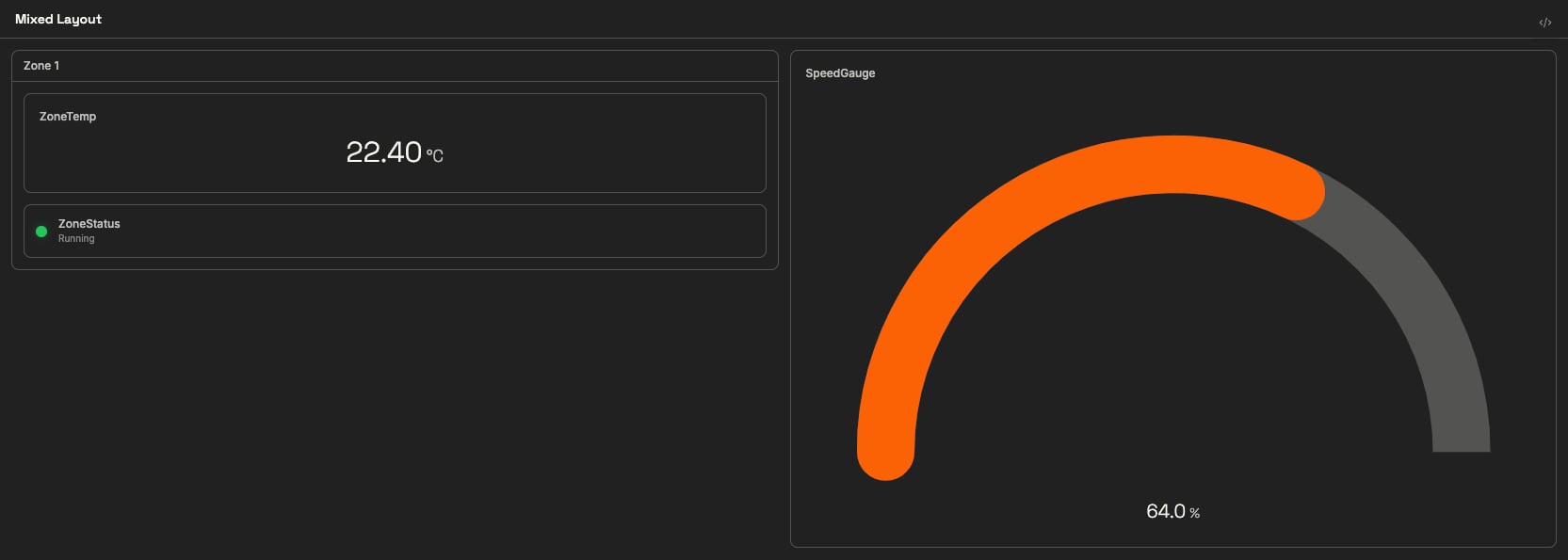
The panel layout positions top-level components. To group several widgets into one grid slot, wrap them in a card: the card occupies a cell (and can span columns like any component), while its children stack inside it. This is how you mix a coarse grid with finer-grained grouping:
The grid sees two cells: the Zone 1 card (stacking a readout and an indicator) and the speed gauge
DEFINE PANEL MixedLayoutWITH VISIBILITY PUBLICWITH STATE PUBLISHEDWITH TITLE "Mixed Layout"WITH LAYOUT "grid" COLUMNS 2 ADD COMPONENT "ZoneCard" WITH TYPE "card" SET TITLE "Zone 1" ADD COMPONENT "ZoneTemp" WITH TYPE "value" BIND VALUE TO TOPIC "zone1/temperature" SET UNIT "°C" ADD COMPONENT "ZoneStatus" WITH TYPE "indicator" BIND STATE TO TOPIC "zone1/status" SET ON_VALUE "running" WITH COLOR "green" SET ON_VALUE "stopped" WITH COLOR "red" ADD COMPONENT "SpeedGauge" WITH TYPE "gauge" SET RANGE FROM 0 TO 100 SET UNIT "%" BIND VALUE TO TOPIC "zone1/conveyor/speed"
The grid sees two components — the card and the gauge — while the card internally stacks a readout and an indicator. Use grid position for independent widgets; use a card when components belong to the same asset and should travel together.
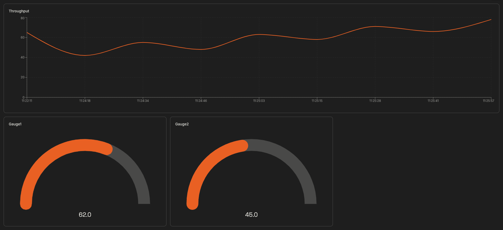
Use AT COLUMN x ROW y to place a component, and SPAN n COLUMNS to stretch it across the grid:
The resulting layout: a chart spanning the full top row with two gauges placed below it
DEFINE PANEL GridExampleWITH VISIBILITY PUBLICWITH STATE PUBLISHEDWITH TITLE "Grid Example"WITH LAYOUT "grid" COLUMNS 3 ROWS 2 ADD COMPONENT "FullWidthChart" WITH TYPE "realtime-chart" AT COLUMN 1 ROW 1 SPAN 3 COLUMNS SET LABEL "Throughput" BIND VALUE TO TOPIC "factory/throughput" ADD COMPONENT "Gauge1" WITH TYPE "gauge" AT COLUMN 1 ROW 2 SET RANGE FROM 0 TO 100 BIND VALUE TO TOPIC "sensor/1" ADD COMPONENT "Gauge2" WITH TYPE "gauge" AT COLUMN 2 ROW 2 SET RANGE FROM 0 TO 100 BIND VALUE TO TOPIC "sensor/2"
A dashboard doesn’t have to fit on one screen. Any component with a click handler can jump to another panel with NAVIGATE TO PANEL "<name>", and the target panel can return with NAVIGATE BACK — the classic pattern is an overview panel with a button per zone, each leading to a detail panel.The overview panel links to the detail panel by name:
The overview panel: a live readout next to a button that opens the detail panel
DEFINE PANEL NavOverviewWITH VISIBILITY PUBLICWITH STATE PUBLISHEDWITH TITLE "Zone Overview"WITH LAYOUT "grid" COLUMNS 2 ADD COMPONENT "Zone1Temp" WITH TYPE "value" BIND VALUE TO TOPIC "sensor/temperature" SET UNIT "°C" ADD COMPONENT "Zone1Details" WITH TYPE "button" SET LABEL "Zone 1 details" ON CLICK DO NAVIGATE TO PANEL "NavDetail"
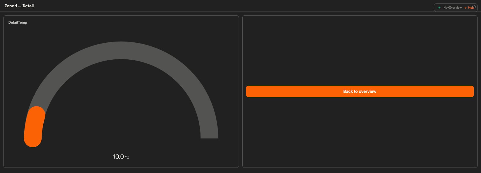
The detail panel offers the way back with NAVIGATE BACK:
The detail panel after clicking the button — its Back button returns to the overview
DEFINE PANEL NavDetailWITH VISIBILITY PUBLICWITH STATE PUBLISHEDWITH TITLE "Zone 1 — Detail"WITH LAYOUT "grid" COLUMNS 2 ADD COMPONENT "DetailTemp" WITH TYPE "gauge" SET RANGE FROM 0 TO 100 SET UNIT "°C" BIND VALUE TO TOPIC "sensor/temperature" ADD COMPONENT "BackButton" WITH TYPE "button" SET LABEL "Back to overview" ON CLICK DO NAVIGATE BACK
Navigation is just another action — it works from buttons, cards, or anything else with an ON CLICK handler. The full action reference is in Actions & Events.
DEFINE PANEL Zone1WITH VISIBILITY PUBLICWITH STATE PUBLISHEDWITH TITLE "Zone 1"
Attribute
Values
Meaning
WITH STATE
DRAFT · PUBLISHED · ARCHIVED
Draft while building (hidden), Published for daily use, Archived to retire without deleting
WITH VISIBILITY
PUBLIC · SHARED · PRIVATE
Who is allowed to open the panel
New panels open in Draft — switch to PUBLISHED when operators should rely on the panel.
PUBLIC panels are open to any connected client; PRIVATE restricts to the creator and admins.
The same lifecycle is surfaced as badges in the Dashboard Manager — see Dashboards in the HUB.
Current HUB behaviour. These attributes are honoured by the renderer but are not yet manageable from the HUB itself: a panel saved without explicit WITH VISIBILITY / WITH STATE values may not appear in the Dashboard Manager list at all, and the manager offers no way to view or change them outside the source text. Until that integration improves, always write both attributes explicitly in the definition.
Properties use SET, not WITH. WITH UNIT "°C", WITH RANGE 0, 100, and WITH DECIMALS 2 do nothing — write SET UNIT "°C", SET RANGE FROM 0 TO 100, SET DECIMALS 2.
WITH TYPE inside a component body does nothing
Component types are set on the header, not in the body. WITH TYPE "line" inside a chart body is silently ignored — use SET CHART_TYPE "line" instead.
The panel saves but does not show up in the Dashboard Manager
Check that both WITH VISIBILITY PUBLIC and WITH STATE PUBLISHED are present — panels saved without them may not appear in the panel list.