

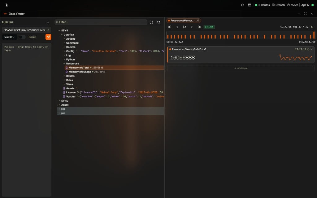
Data Viewer with the Publish panel on the left, Topic Tree expanded to $SYS/Coreflux/Resources in the center, and the Resources/MemoryInfoTotal topic plotted live on the right
Why Use the Data Viewer?
You need to see what data is flowing through your broker—which topics are active, what payloads look like, and how to send test messages. The built-in Data Viewer in the Coreflux HUB lets you subscribe to topics, browse the topic tree, and publish messages without installing an external MQTT client.When to Use It
- Viewing device data — Subscribe to sensor or device topics to see live readings (temperature, status, etc.) as they arrive
- Exploring your topic structure — Browse the Topic Tree to understand which topics exist and how they are organized
- Verifying Actions — Subscribe to output topics to confirm your LoT Actions are publishing correctly
- Debugging — Inspect payloads and topic structure in real time
- Testing — Publish messages to trigger Actions, test Routes, or simulate device data
- Monitoring broker activity — Watch
$SYStopics to check broker health, connected clients, and message throughput
Accessing the Data Viewer
- In the HUB top navigation, select MQTT, then Data Viewer.
- The Topic Tree appears on the left, showing topics as they receive messages.
- Select a topic to view its payloads in the right panel.
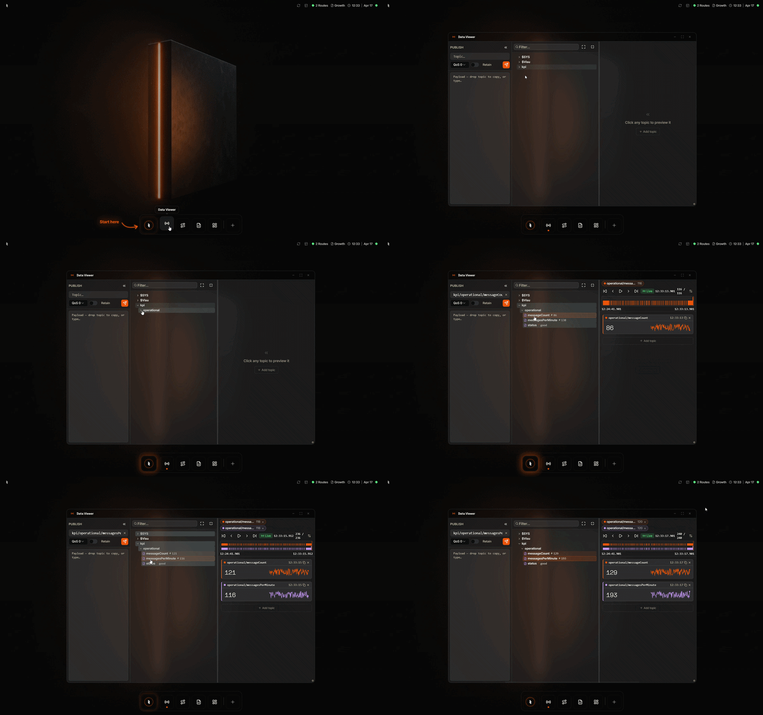
Opening the Data Viewer from the Coreflux HUB dashboard
Topic Tree
The Topic Tree shows the hierarchical structure of topics. Topics appear as messages are received. Expand branches to navigate and select a topic to view its payload history in the payload viewer.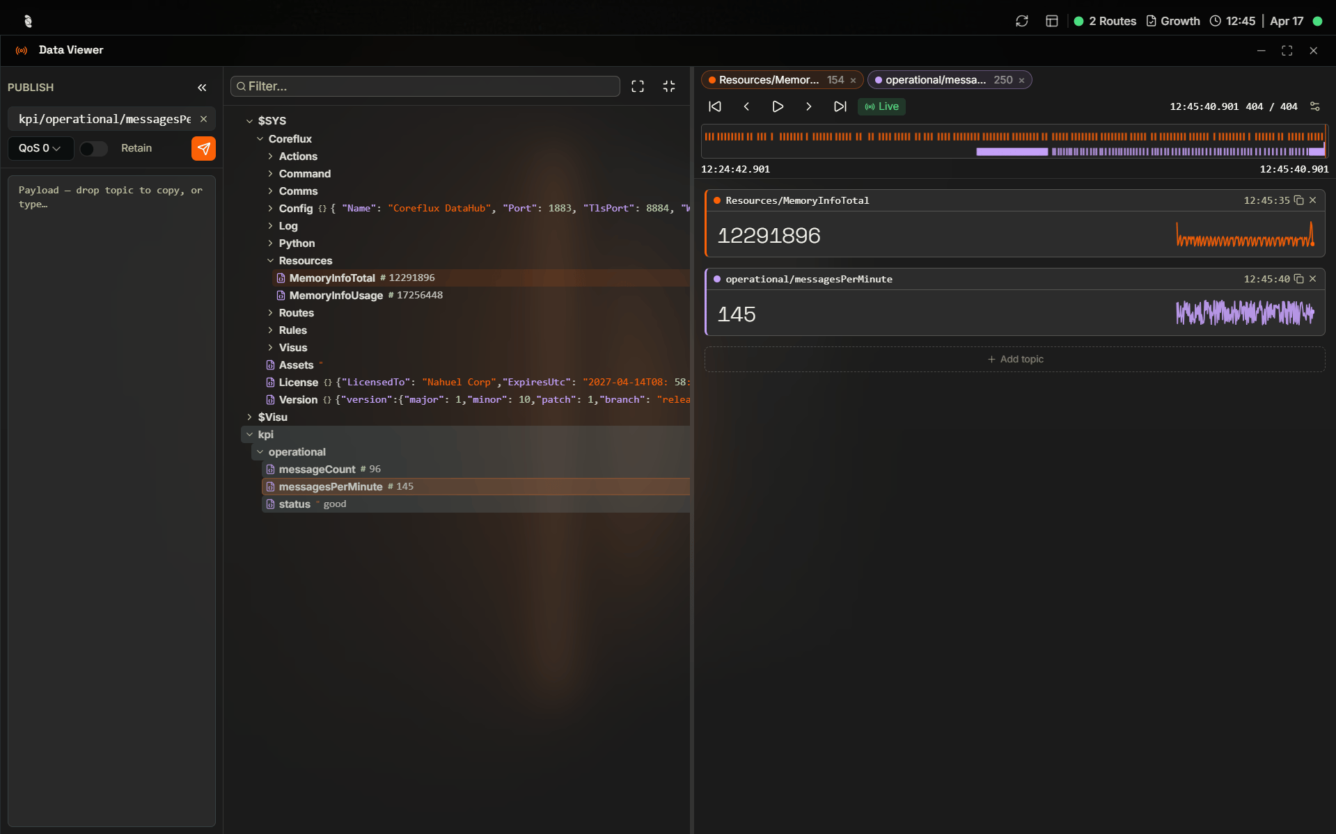
Topic Tree expanded to $SYS/Coreflux/Routes with the SiemensS7Route LoT definition shown in the payload viewer and a live message timeline at the top
Exploring Live Data
The Data Viewer is laid out as three vertical panels: Publish on the left, the Topic Tree in the middle, and a Detail area on the right where you build a personal view of the topics you care about right now. You can drag the divider between the tree and the detail area, and collapse the Publish panel into a thin rail to give yourself more room.Previewing a topic
Get a feel for what is happening on the broker without committing to a layout. Click any topic in the tree and its latest payload appears in the Detail area as a quick preview. Each row in the tree carries a small type icon that tells you at a glance what kind of value the topic currently holds:sensors/#, and every matching topic appears in the tree as messages come in.
Tracking what matters
Once a topic is worth watching, pin it: double-click the topic, or drag it from the tree onto the Detail area. A card appears for it, and the card shape adapts to the payload so you don’t have to mentally decode raw values:- Numbers render as a large value with a sparkline of recent history — perfect for sensor readings like temperature or RPM.
- Booleans render as a glowing lamp — green when
true, dim whenfalse. - JSON and text render with colored keys and an expandable tree, so nested objects stay readable.
- Geolocation payloads (latitude/longitude) render as a small map with the current point and a trail of recent positions, plus the raw payload underneath.
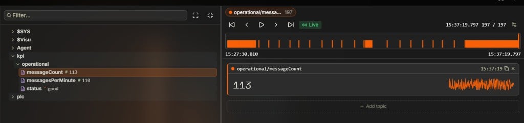
Tracking kpi/operational/messageCount: the tree on the left shows live values with type icons, while the right panel pins the topic as a card with the current value (113) and a sparkline of recent history, plus a timeline of the last 197 messages above it
Replaying history with the timeline
As soon as you are tracking topics with more than one message of history, a timeline appears at the top of the Detail area. Every tracked topic gets its own color, and every message it has received is drawn as a colored mark on a horizontal track. From there you can:- Click or drag anywhere on the track to scrub to a moment in time — every card below jumps to the values they had then.
- Step message-by-message with First / Previous / Next / Last.
- Hit Play to replay the message history like a video, with cards animating through every value.
- Tap Live to snap back to the latest message and resume real-time updates (the label turns green when you are caught up).
- Open the gear icon to change the history buffer per topic, from 50 up to 2 000 messages — larger buffers give you more scrub range.

Timeline tracking two operational topics across 450 messages: each topic gets its own colored chip and row, playback controls sit on the left, the Live indicator confirms real-time updates, and the counter on the right shows the current position and timestamp
Drilling into payloads
When a payload is too big to read inline, click its preview in the tree to open the payload inspector — a floating window that parses the full payload and lets you expand JSON to any depth. If the payload contains coordinates, the inspector also draws a small map at the top. For payloads where you only care about one number, drag a single value out of the inspector (or out of a card’s expanded JSON tree) onto the Detail area. That value becomes its own extraction card — a small card that tracks just that one field, sparkline included if it’s numeric. It’s the fastest way to followtemperature from a 30-field sensor payload without the surrounding noise.
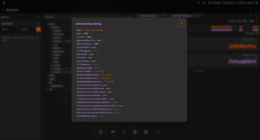
Payload inspector opened for $SYS/Coreflux/Config: the full broker configuration payload is parsed and laid out field-by-field with colored keys and values, ready to drill into or drag from
Drag-and-drop cheatsheet
Most of the viewer is built around dragging. While you are dragging, valid drop zones light up so you can’t miss them.Publishing Messages
To publish a test message:- Select or enter the target topic.
- Enter the payload (plain text or JSON).
- Click Publish to send the message.
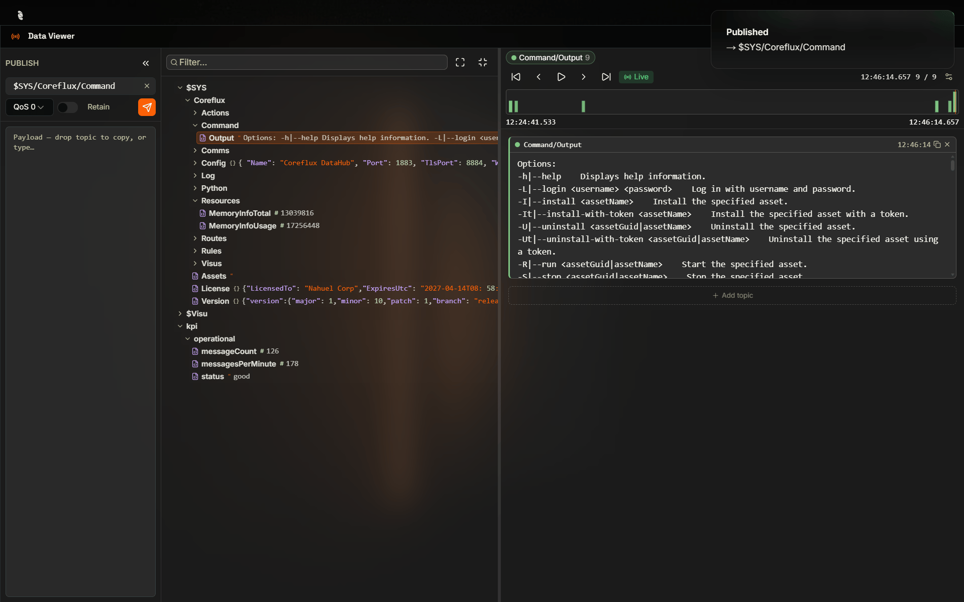
Publishing a command to $SYS/Coreflux/Command with a success confirmation toast